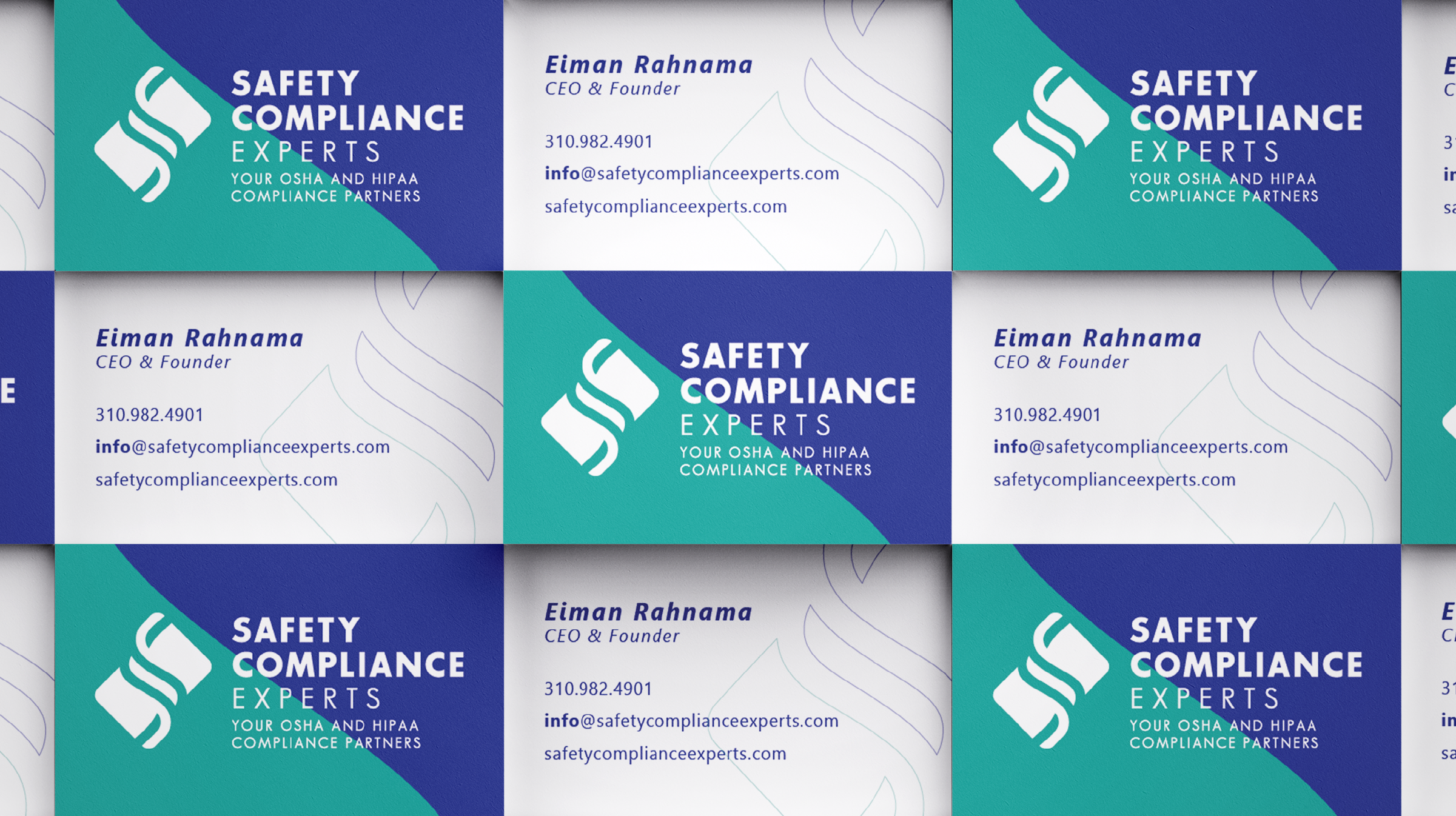
Safety Compliance Experts

The safety of the people in the health industry, from private medical information to the hazardous workplace environment, is a crucial pillar in the health business that requires much expertise and many hours of training to comply with all the regulations.

Seriousness, health, compliance, and simplicity were the keywords to create the logotype and branding. The symbol is a personalized "S" (from "Safety") that embraces a curved diagonal rectangular. The final design is meant to be an unusual shape, inspired by the biohazard symbol. The blue and teal green mix the most common colors used in the medical field, while representing seriousness and health. While studying the font's weight, I kept "Safety" and "Compliance" in bold with its signature colors, but I used a lighter weight for "Experts" as it was becoming too heavy with all bold. The lighter weight on "Experts" (along with the gray color) balances "Safety Compliance" with its tagline "Your OSHA and HIPPA Compliance Partners" - and it also lightens up the brand, as "SCE" is here to make health compliance easier for their clients.

Previous
Previous

The Premium Cuisines

Next
Next

Shimmer Dental